

Design Trends
The Wall Art Rule That Stops a Room Looking Random
Most wall art fails for one simple reason: it is chosen after the room, not as part of it. Learn the scale rule designers use before putting another nail in the wall.
6 min read
The fastest way to make a home look expensive is not buying expensive decor. It is fixing the scale, light, and material mistakes most rooms are built around.

When a room feels unfinished or basic, our default reaction is to blame our budget. We tell ourselves that if we just had the money for that four-figure mohair armchair or a custom travertine coffee table, the space would finally look expensive.
But here is the designer's secret: the reason your home looks cheap has almost nothing to do with what you spent. It has everything to do with how the room is composed. Most rooms are built around a series of silent, systemic mistakes—errors in scale, lighting, and materials that even the most expensive furniture cannot hide.
If you want a home that feels premium, you do not need to spend more. You need to fix the composition. Here are the five critical shifts that elevate a space instantly.
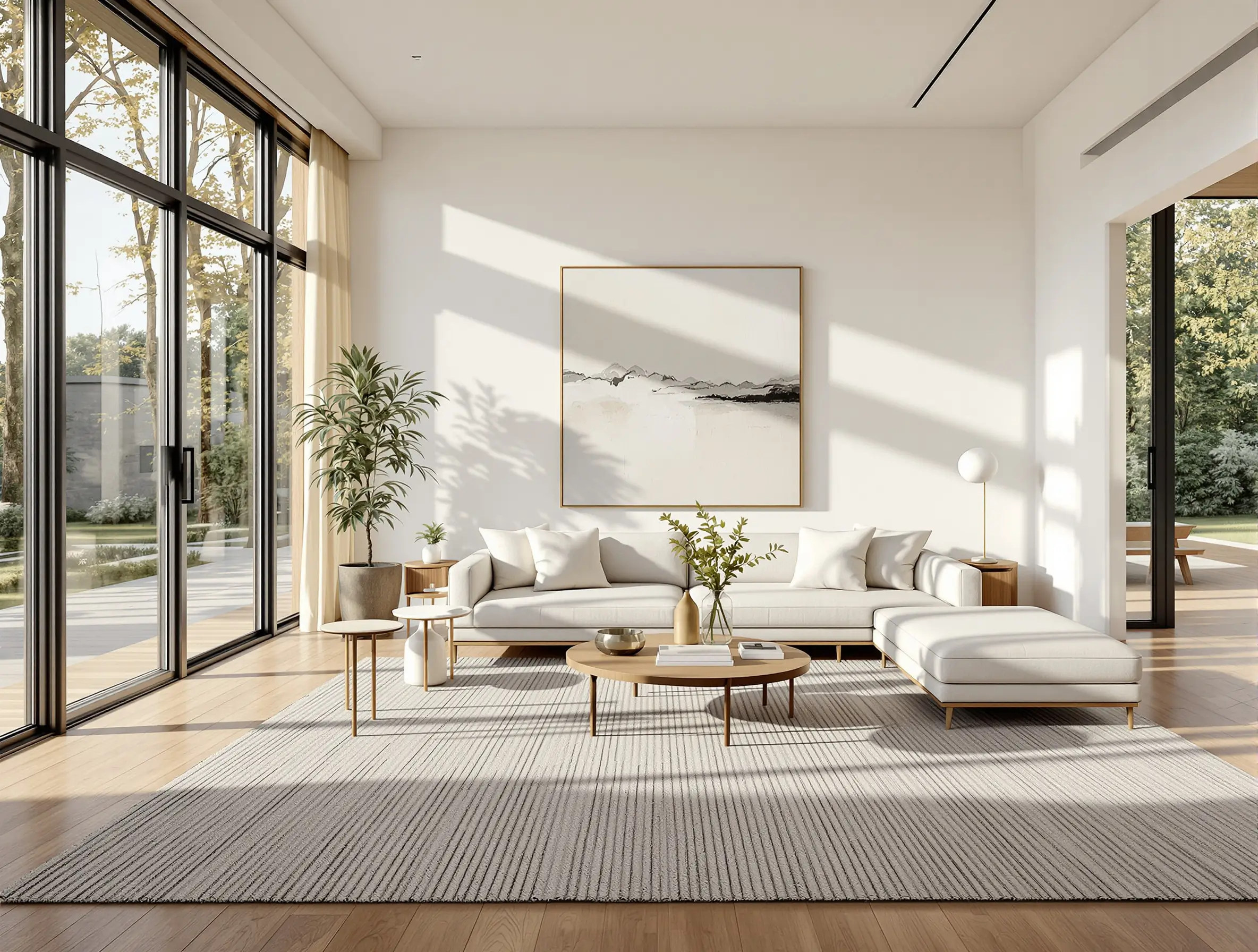
The single most common mistake in residential living rooms is an undersized rug. A small rug behaves like a floating island in the middle of the floor, forcing your seating to hover awkwardly on the perimeter or sit entirely off the rug. This breaks the unity of the conversation zone, makes the room feel smaller, and signals "budget buy" louder than any other element.
To make a room look expensive, the rug must anchor the layout. Ideally, all your furniture legs should sit on it; at a bare minimum, the front legs of the sofa and chairs must be firmly planted on the rug. This anchors the room and visually expands the space. And if you are using a thin rug, do not skip the pad. A thick felt pad makes a cheap flatweave feel like a heavy, custom-woven commission. Put a proper pad below it.
Design Studio Feature
Stop making your rug float. Map your living room furniture boundaries and test your ideal rug dimensions instantly inside The Scale & Placement Guide.
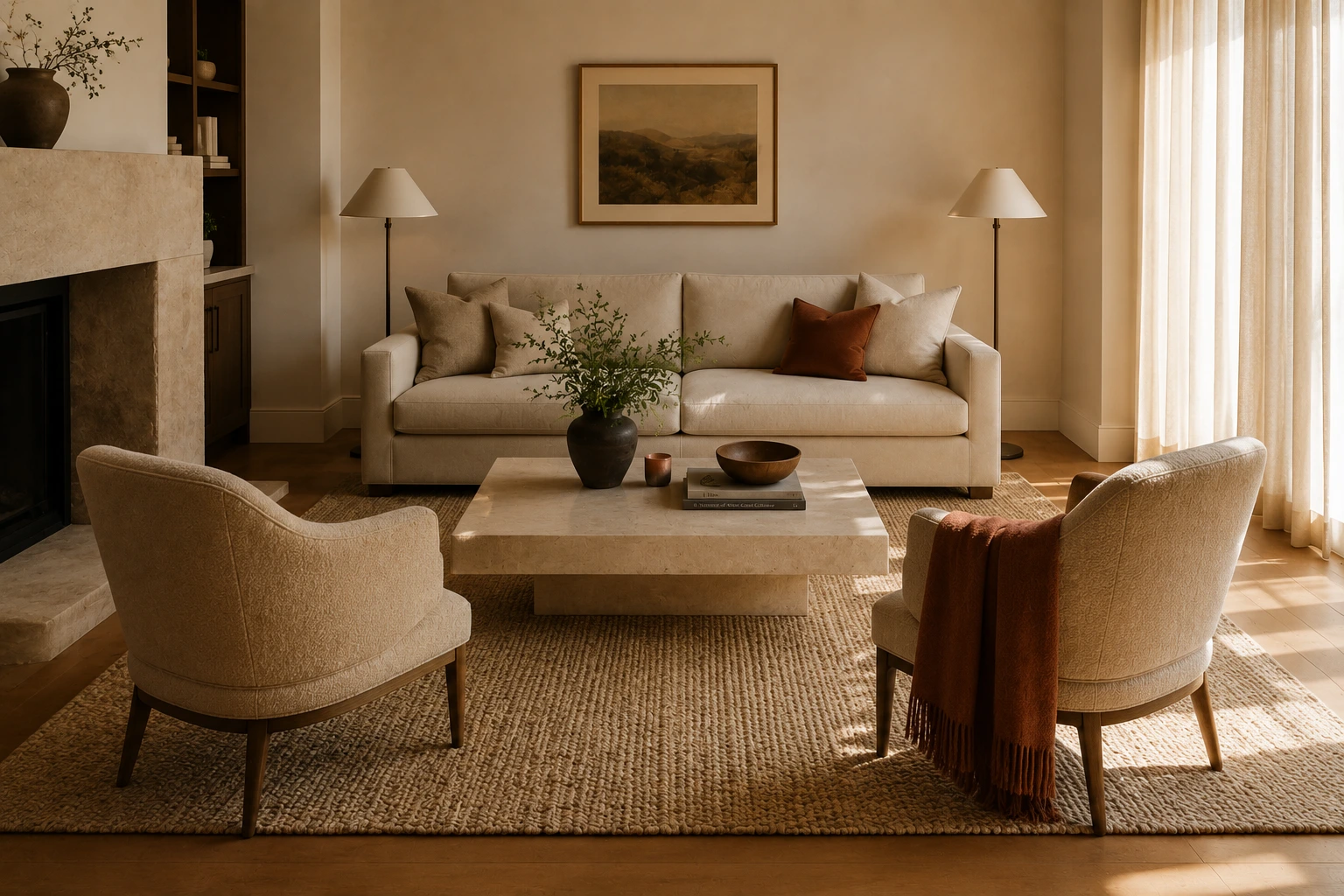
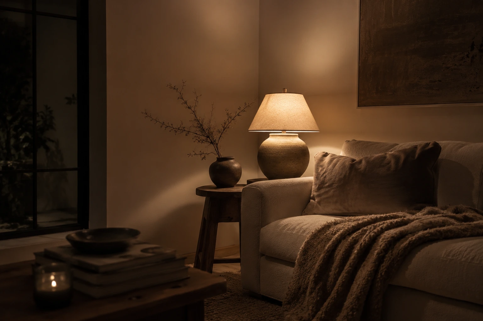
If you rely on a single overhead light source—especially a grid of bright, recessed spotlights—you are flattening your space. Harsh, overhead light washes out the textures, creates cold, clinical shadows, and highlights every shortcut.
Expensive-looking rooms are defined by shadows and contrast. Turn off the "big light" and layer your illumination at different heights. You need a mix of table lamps, floor lamps, and wall sconces. Keep your bulbs warm—ideally 2700K or lower—to create a golden, atmospheric glow. This simple swap hides cheap materials, adds instant drama, and makes your home feel cozy during a workspace الفيديو call, and late at night.
Design Studio Feature
Avoid clinical 4000K lighting traps. Calculate your living room's exact target lumens and layering plan with The Room Ambience Planner.
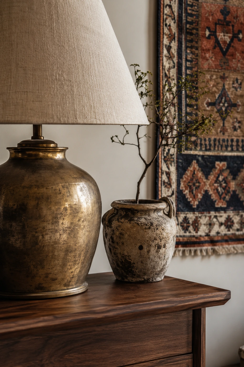
Builder-grade cabinet handles, plastic switch plates, and flimsy plastic drawer pulls are details that register subconsciously. You can have a beautiful kitchen, but if the cabinet knobs are hollow plastic coated in shiny fake chrome, the illusion is broken the moment you touch them.
Upgrade these touchpoints. Replace your basic hardware with solid brass, aged bronze, or matte black steel. You do not need to buy these from high-end design showrooms; you can find fantastic, heavy-weight options online or at local salvage yards for a fraction of the cost. Because you interact with these details daily, upgrading them gives the entire room a solid, bespoke feel.
Cheap-looking rooms are often painted in flat, stark white paint that exposes every wall defect and feels cold under daylight. Expensive-looking rooms use paint with depth and complexity—neutral tones with rich undertones that respond dynamically to changing light throughout the day.
When choosing a paint color, consider the room's orientation. A north-facing room with cool, blue daylight needs a warm-toned neutral to prevent it from feeling sterile. A south-facing room can handle cooler greys or deep, moody colors. Invest in a eggshell or matte finish rather than a high-gloss, which can look harsh and show imperfections. A quiet, complex paint job says premium. It is a quieter one.
Design Studio Feature
Neutral paint lives or dies by your specific window orientation. Predict how putty, mushroom, or bone whites will shift in your space inside The Paint & Light Harmony Studio.
The final mistake is matching too much or over-styling. Buying a full set of matching furniture looks like a showroom window rather than an authentic home. Similarly, filling every surface with cheap plastic trinkets, generic candles, and fast-decor accents creates visual clutter that signals a lack of intent.
Instead, edit down your decor. Group items in clusters of odd numbers (like threes), vary their heights, and let your surfaces breathe. One large, rustic ceramic vase with a single cut branch from the garden looks infinitely more expensive than five small, matching plastic bud vases. Focus on texture—linen, wood, stone, wool—to create visual warmth without adding noise.
Written by
Sarah BigelowLead Designer & Founder, Bigelow Designs
Sarah Bigelow is the lead designer and founder of Bigelow Designs. With over 15 years of experience in residential interiors, she tests every layout, material, and fixture in real homes before recommending them.
Keep reading
Most wall art fails for one simple reason: it is chosen after the room, not as part of it. Learn the scale rule designers use before putting another nail in the wall.
6 min read
Honest home decor ideas that actually work. Learn affordable, DIY, and modern ways to style any room, step by step, even if you rent or have a small budget.
7 min read
Why interior designers never turn on the overhead light. Discover how to use layered ambient lighting to instantly make your home feel expensive and cozy.
3 min read
The Insider Circle
Craving more interior inspiration? Watch our exclusive behind-the-scenes room tours on TikTok and join our Facebook community for daily design secrets.
Join the conversation
Thoughts, questions, or your own experience with this piece? Sign in with your Facebook profile to reply.

