

Design Trends
Your Home Looks Cheap for One Reason—and It Isn’t Your Budget
The fastest way to make a home look expensive is not buying expensive decor. It is fixing the scale, light, and material mistakes most rooms are built around.
6 min read
Most wall art fails for one simple reason: it is chosen after the room, not as part of it. Learn the scale rule designers use before putting another nail in the wall.

When we see a room that feels disconnected or cold, we often think it needs more decor. We buy another brass candlestick, a stack of art books, or a round mirror. But more often than not, the issue is not the lack of objects—it is the wall art.
Too many homes feature art that looks entirely random: a small print hung too high above a large sofa, a collection of mismatched frames scattered across a hallway, or a canvas that fights the room's color story.
The secret to a polished room is simple. You do not choose art because you like it in isolation; you choose it because it has a specific architectural role to play in the room. Here is the designer's guide to choosing and hanging wall art that anchors your space.
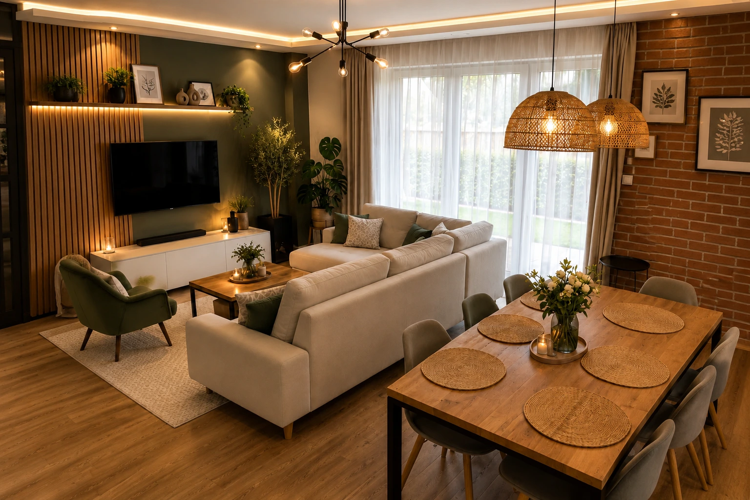
Wall art is not just decoration; it is a tool to define scale and establish layout. Its first job is to anchor the furniture it sits above.
When hanging art above a sofa, console table, or headboard, the frame must relate to the width of the furniture. A good rule of thumb is that the artwork (or group of artworks) should span between two-thirds and three-quarters of the furniture's total width. Any smaller, and the art looks lost, floating aimlessly in space. Furthermore, the distance between the bottom of the frame and the top of the furniture should be relatively tight—usually six to eight inches. The gap should feel connected, not nervous.
Design Studio Feature
Eliminate the guesswork of hanging art and curtains. Calculate your exact artwork placement heights and sofa-to-frame ratios inside The Scale & Placement Guide.
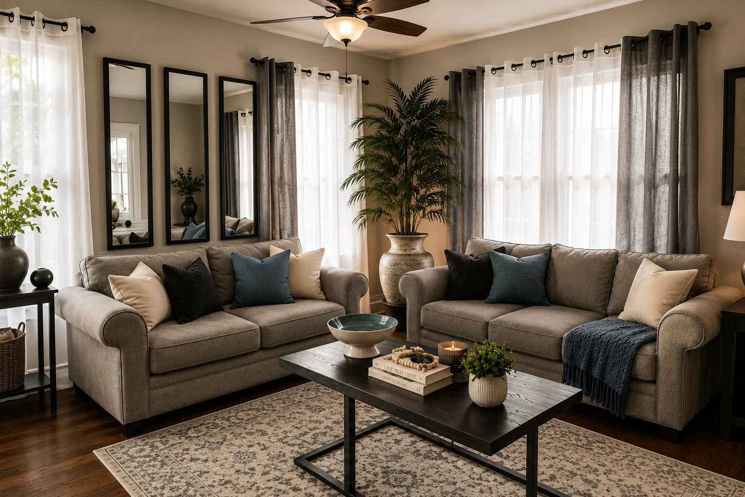
Many homeowners use mirrors as a default solution for empty walls. They believe a mirror will automatically make a room feel bigger and brighter.
But a mirror only works if it has something beautiful to reflect. If you hang a mirror opposite a blank wall, a television, or a cluttered shelf, you are simply doubling the visual noise or flatness of that space. Instead, treat a mirror like a canvas. Use it to reflect a window with a view, a piece of architectural molding, or a beautifully lit corner. If it does not reflect something interesting, swap it for art, or buy it for what it contributes to the material palette.
Design Studio Feature
Mirrors and frames react heavily to surrounding Kelvin levels. Plan your room's layered lighting and color temperature balance with The Room Ambience Planner.
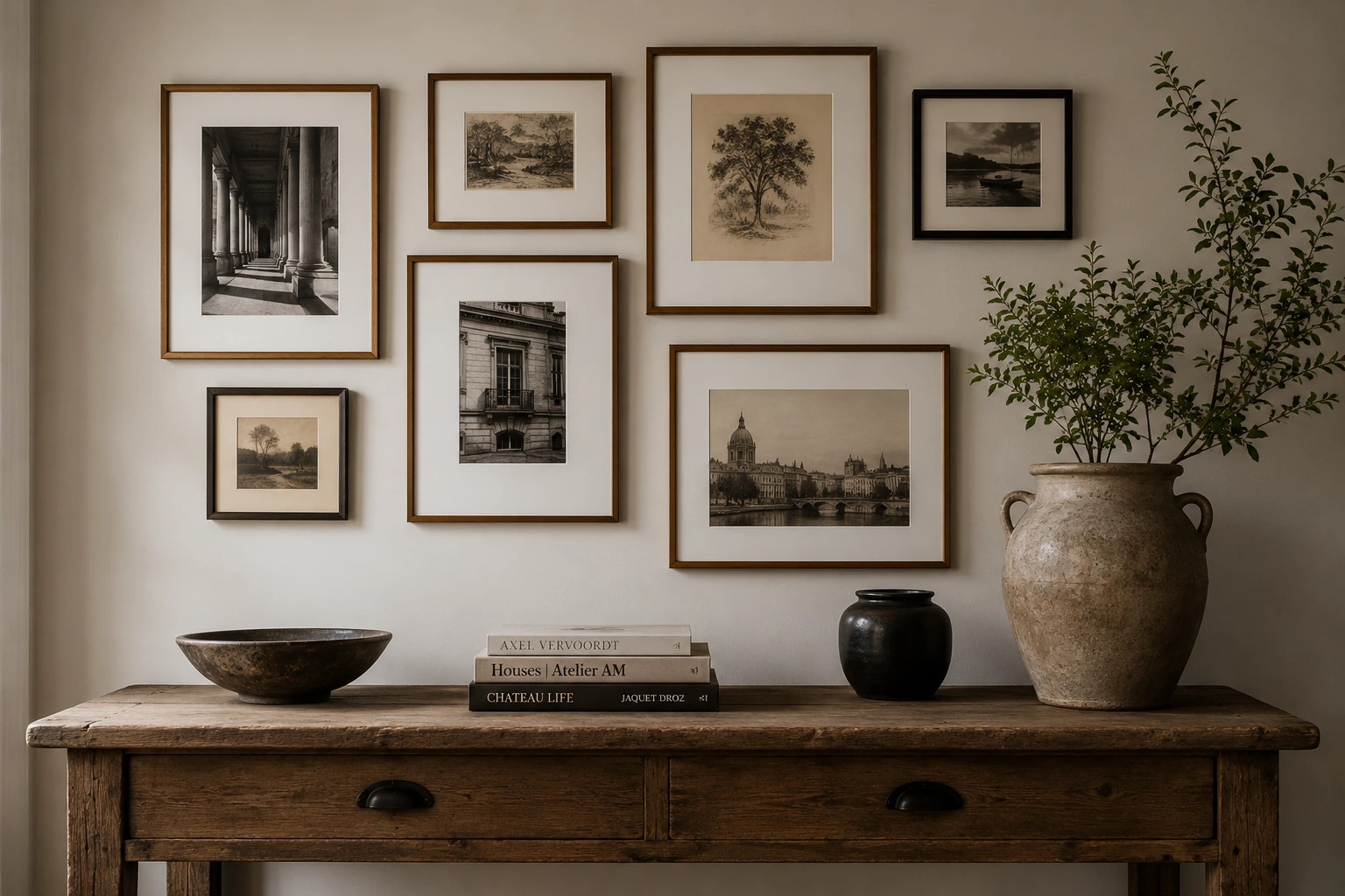
Gallery walls can easily cross the line from curated to chaotic. A successful gallery wall relies on a unifying element to tie the collection together.
This could be matching frame styles, a consistent color palette, or a strict grid layout. If you are mixing different frame types and art styles, map out the arrangement on the floor first. Keep the spacing between frames tight and consistent—about two to three inches—and treat the entire grouping as a single large piece of art. This prevents the individual prints from looking scattered.
Matching your art's exact colors to your throw pillows and rugs is a quick way to make your home look like a builder's model unit. It feels too safe, flat, and sterile.
High-end design relies on contrast and tension. If your room is decorated in cool greys and whites, look for art with warm earth tones, deep charcoals, or a splash of ochre. The art should feel like a distinct voice in the conversation, not a silent echo. Let it introduce a new texture, establish a focal point, or give a long room a destination.
Design Studio Feature
Art creates visual tension against your wall color. Predict how neutral paints and undertones will shift under your natural window orientation inside The Paint & Light Harmony Studio.
A cheap print in a beautiful frame looks premium; an expensive canvas in a cheap, warping frame looks basic. Never overlook the frame.
Avoid thin, cheap plastic or composite frames. Instead, invest in solid wood or clean metal frames. Using a wide mat board (the paper border around the print) is a classic trick to make small art look custom and expensive. A three-inch mat board instantly elevates a simple sketch or photograph, giving it breathing room and scale.
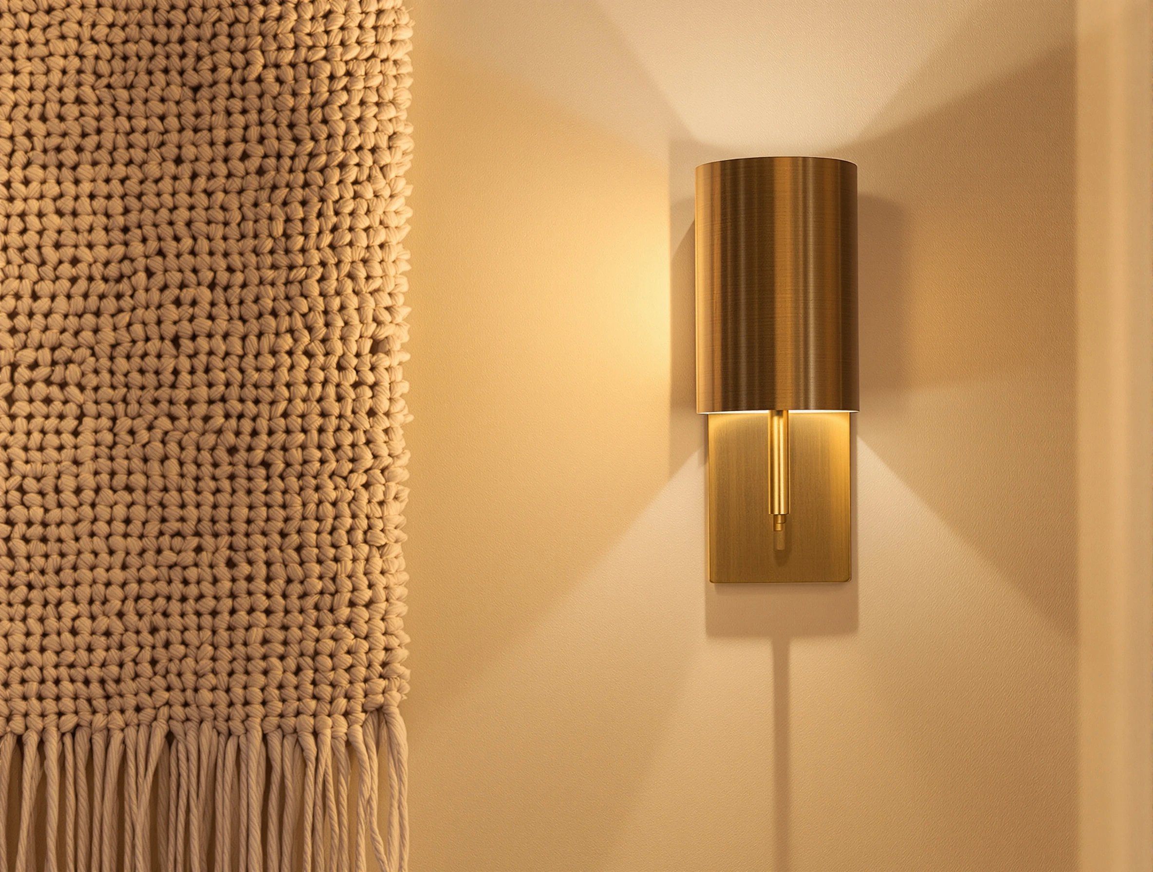
Art does not have to be a oil painting or a framed print. In fact, a room can feel monotonous if every wall holds a flat, rectangular frame.
Introduce three-dimensional interest. Woven textile hangings, sculptural clay wall pieces, antique wooden carvings, or plaster reliefs add relief and texture. These organic materials break up the flat drywall surfaces, absorb sound, and introduce a tactile layer that feels curated and layered over time.
Written by
Sarah BigelowLead Designer & Founder, Bigelow Designs
Sarah Bigelow is the lead designer and founder of Bigelow Designs. With over 15 years of experience in residential interiors, she tests every layout, material, and fixture in real homes before recommending them.
Keep reading
The fastest way to make a home look expensive is not buying expensive decor. It is fixing the scale, light, and material mistakes most rooms are built around.
6 min read
Interior design trends 2026, checked against Houzz and 1stDibs data. See the 153% brown search rise, what is forecast, and what to try at home.
7 min read
The trend cycle wants you to replace your home every year. A veteran designer explains which current ideas have staying power—and which ones will look tired fast.
6 min read
The Insider Circle
Craving more interior inspiration? Watch our exclusive behind-the-scenes room tours on TikTok and join our Facebook community for daily design secrets.
Join the conversation
Thoughts, questions, or your own experience with this piece? Sign in with your Facebook profile to reply.

