Most 2026 trend forecasts were written in the autumn of 2025. We're now in August 2026, which means we can do something the forecasts couldn't: check them against what really happened.
The prompt for this piece was Wimberly Interiors' 2026 forecast, published on WATG's site on 11 December 2025 and updated again on 16 July 2026. It's a hospitality forecast, not a residential one, and that distinction matters more than most articles admit. Hotel design and home design borrow from each other, but they run on different clocks and different budgets.
Here's the short version before the detail.
The forecast got the mood right and the color wrong. The shift toward warmth, texture, lived-in surfaces and rooms that feel personal is real and shows up in almost every independent source. The specific prediction that green would be the dominant palette of 2026 didn't play out that way at the residential level, where browns, khakis and off-whites took the biggest headlines. And a third camp, led by Pinterest's data, predicted the opposite of quiet altogether.
Wimberly Interiors is the interiors arm of WATG, a hospitality architecture firm. Their piece pulls quotes from nine of their own principals and directors, so read it as informed professional opinion from one studio rather than as survey data or market research. That's not a knock. It's just the right weight to give it.
Their five headline directions were:
- multisensory design over photogenic design,
- hyper-localization instead of a global-generic look,
- wellness built into the architecture rather than parked in the spa,
- material honesty using surfaces that patina, and
- green as the defining color.
The piece frames luxury as something you feel on arrival rather than something a room announces, and the phrasing throughout leans emotional rather than technical.
Two of those five translate cleanly to a house: material honesty and multisensory thinking are basically free to apply at home. The other three are harder, because "hyper-localization" in a hotel means commissioning regional artisans, and at home it usually means buying something on Etsy from three time zones away.
This is the part worth checking carefully, because it's the most specific claim in the forecast and the easiest one to test.
Paint brands announce a color of the year each autumn. For 2026 they went in visibly different directions:
- Benjamin Moore chose Silhouette AF-655, described as a blend of espresso and charcoal notes.
- Sherwin-Williams and HGTV jointly picked Universal Khaki SW 6150.
- Behr went with Hidden Gem N430-6A, a smoky jade blue-green.
- Valspar chose Warm Eucalyptus, an earthy gray-green.
- PPG and Glidden went with Warm Mahogany, a rich red-brown.
- Pantone, meanwhile, went to the far end of quiet with Cloud Dancer, an off-white.
So green wasn't absent. Behr and Valspar both landed in that family, and AkzoNobel did too. But brown, khaki and white took the loudest positions, and one long-running tracker noted that the Benjamin Moore pick was its least colorful selection since 2019, which fits a broader move away from bright color and toward deep neutrals.
My read: the Wimberly forecast wasn't wrong about green so much as it was describing a hospitality palette. Deep mineral greens paired with burnished metal read as luxury in a hotel lobby. In a suburban living room with one north-facing window, that same green reads as dark. The residential market went for the warmer, more forgiving version of the same instinct.
If you were about to paint a room green on the strength of a trend piece, that's the caveat. The color is fine. The reason to use it should be your light and your furniture, not a forecast.
Here's what most coverage misses by reporting one forecast at a time. Three credible sources predicted three different 2026s:
- Hospitality studios predicted quiet, tactile, emotionally restrained rooms.
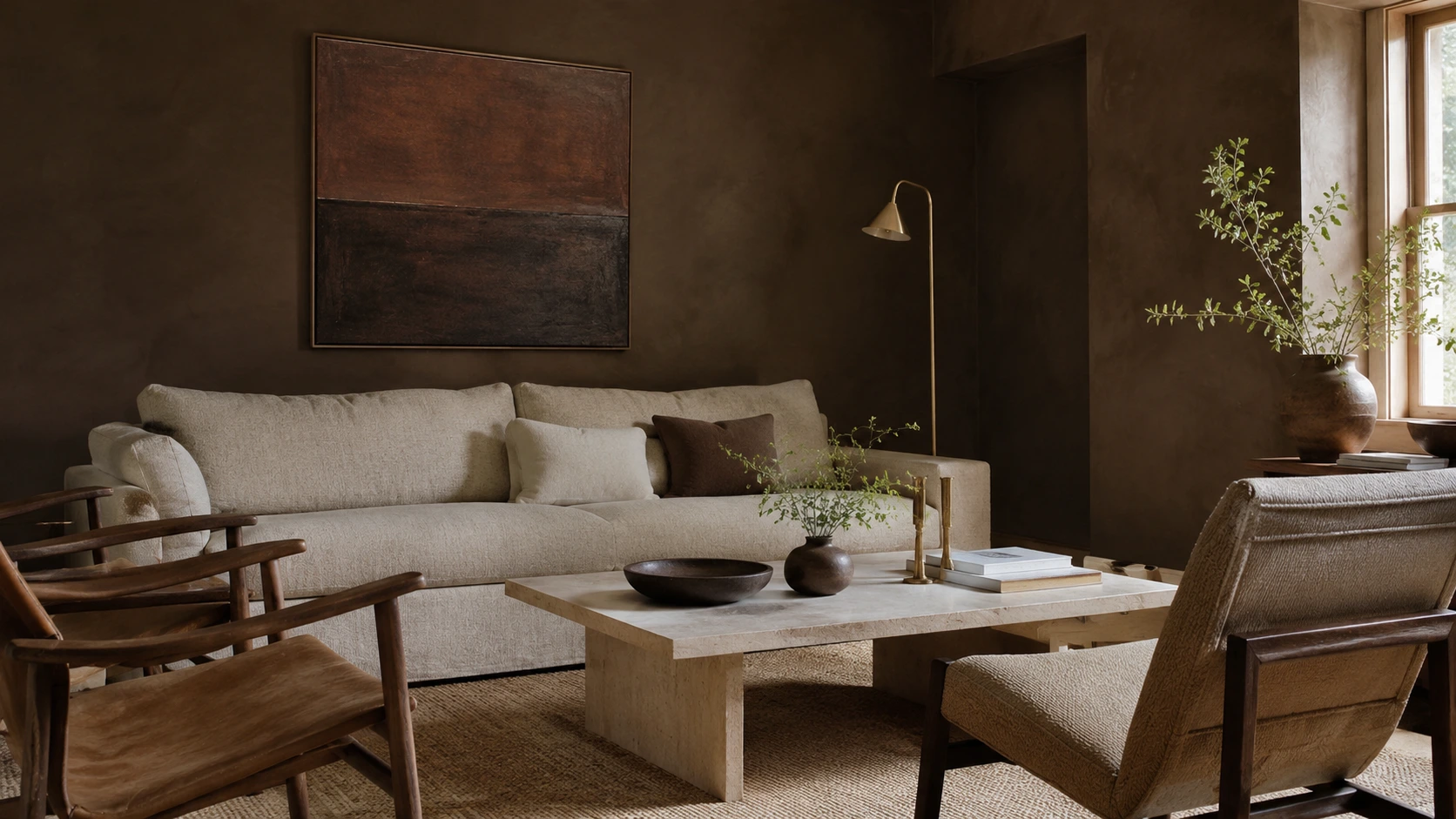
- Paint companies predicted warm neutrals, espresso browns, and depth.
- Pinterest, working off search data from 600 million monthly users, predicted the opposite of both: bold searches for circus-inspired interiors and rising interest in striped ceilings, noting trends move roughly 4x faster than seven years ago.
That isn't a contradiction to resolve. It's a market that has genuinely fractured, and it's the single most useful thing to understand about 2026. The professional design world and the algorithmic inspiration world are no longer forecasting the same year.
The most reliable signal in trend coverage is usually the negative one. It's easier to get people to name what they're sick of than what they'd bet on.
The complaints cluster around sameness:
- Fluting: Designers interviewed by House Beautiful pointed to fluting as a detail that lost its charge once it appeared on every mass-produced credenza and bar cabinet.
- Single accent walls: Flagged as a lazy fix that rarely solves the spatial balance of a room.
- Cold greige: Called finished everywhere, with the argument that a house shouldn't look like a spec showroom.
- Unused formal rooms: In a May 2026 survey, designers flagged formal living rooms that never get used, arguing that a room your kids and pets aren't allowed into isn't serving anyone.
Skip the color-of-the-year decision entirely if you're unsure. Nothing in the evidence suggests a single 2026 shade you're supposed to adopt.
The parts of the forecast that survive contact with a real house are the practical ones:
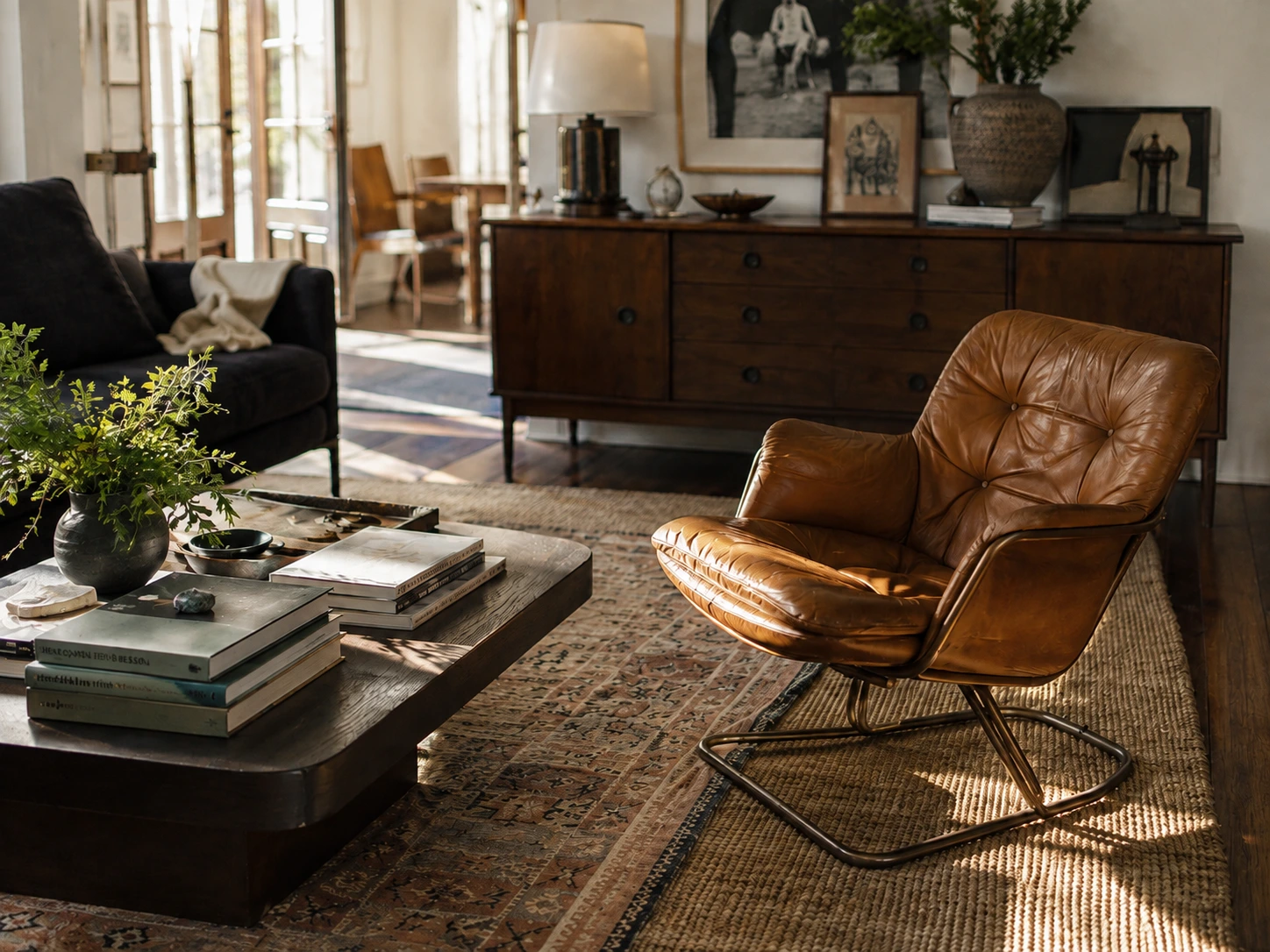
- Buy things that age instead of things that stay perfect: Leather that scuffs, unlacquered brass, honed stone, solid wood. The "material honesty" argument holds up because it prevents replacing furniture every four years.
- Fix the light and the sound before you fix the palette: Layered lamps at different heights, 2700K warmer bulbs in the evening, a thick rug in a room that echoes.
- Mix in something old: Vintage stops a room from looking like a catalog, and it's usually higher quality than the new equivalent.
- Make the underused room useful: If there's a formal space nobody sits in, turn it into a library, media room, or casual lounge.
- Whether the maximalist direction Pinterest flagged actually converts into retail purchases or stays an aspirational search.
- Whether the green call was early rather than wrong. Color trends often take two to three years to move from boutique hospitality projects into mainstream residential retail.
- Wimberly Interiors / WATG, "Interior Design Trends 2026: Authenticity, resonance, and resilience"
- Benjamin Moore Color Trends 2026 (Silhouette AF-655) & Sherwin-Williams / HGTV (Universal Khaki SW 6150)
- Behr (Hidden Gem), Valspar (Warm Eucalyptus), PPG/Glidden (Warm Mahogany), Pantone (Cloud Dancer)
- Pinterest Predicts 2026 Trend Report
- Homes & Gardens & House Beautiful Designer Surveys (2026)


