

Design Trends
Interior Design Trends 2026: What's Actually Worth Following
Is 2026 the year we finally abandon cold minimalism? Discover which interior trends are actually worth your money and which ones to let pass.
7 min read
Interior design trends 2026, checked against Houzz and 1stDibs data. See the 153% brown search rise, what is forecast, and what to try at home.

Every autumn and spring, design magazines publish dramatic declarations: "Neutrals are officially dead," "Maximalism has taken over," or "Color drenching is mandatory."
Yet when you look beneath the editorial hyperbole and analyze what real homeowners and practicing interior designers are actually searching for, specifying, and purchasing across platforms like Houzz and 1stDibs, a radically different narrative emerges.
Neutrals didn't die. In fact, searches for warm neutrals climbed steadily over the past twelve months. But what homeowners mean by "neutral" has undergone the most significant structural evolution in fifteen years.
Here is the data-backed reality of interior design trends in 2026—examining the 153% surge in chocolate brown, the resilience of textured warm neutrals, what commercial platform data forecasts, and how to execute these shifts in your own home without falling into short-lived trend traps.
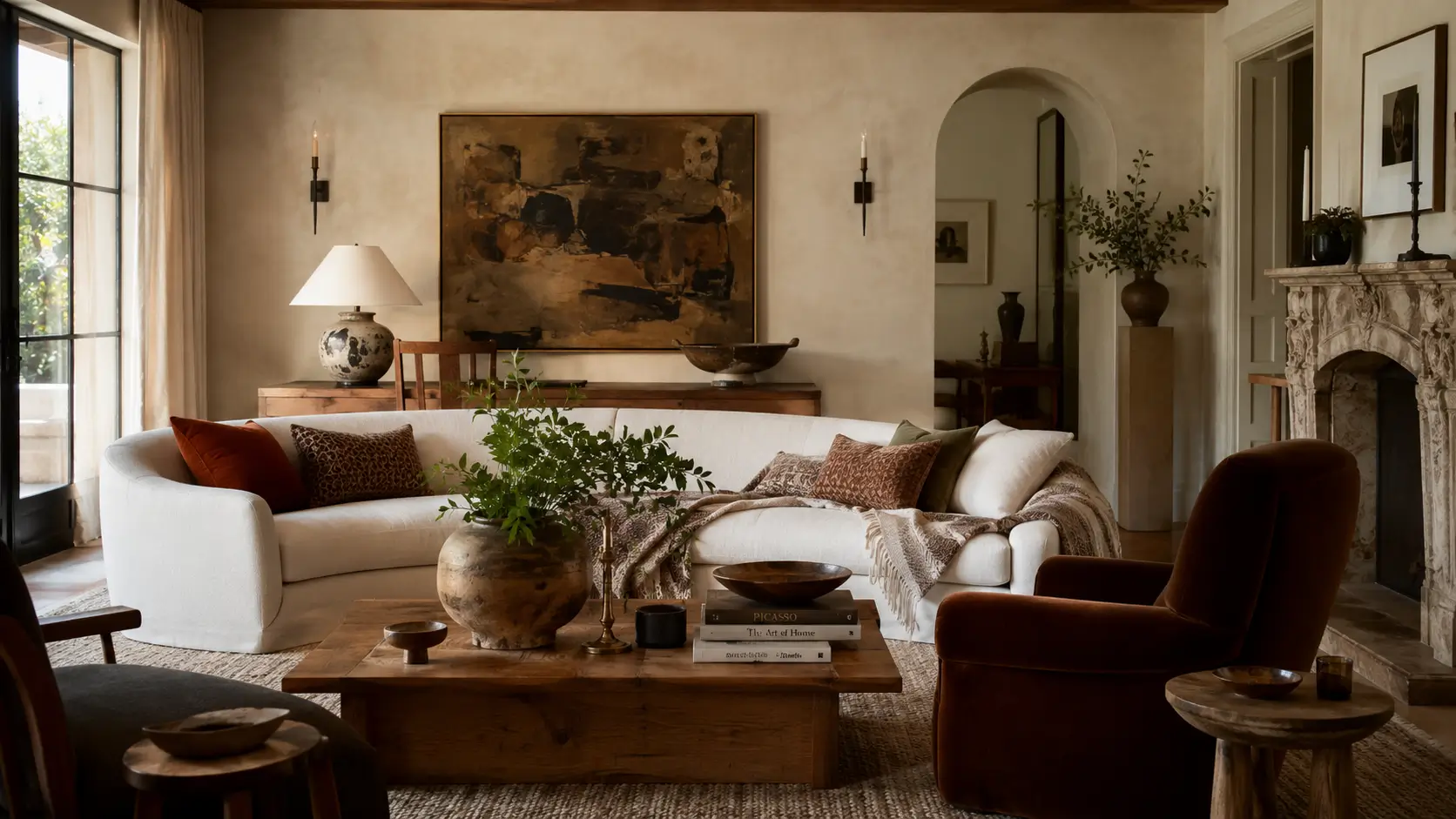
When trend forecasters look only at runway fashion or Milan design week concept prototypes, they often miscalculate residential adoption. The truest indicator of real-world home transformation is verified search query data and trade marketplace transaction logs.
Across Houzz's 2026 search analytics and the annual 1stDibs Interior Designer Trends Survey, three undeniable macro shifts have taken place:
| Search Term / Category | Platform Metric (YoY Shift) | Commercial Implication | Design Longevity Rating |
|---|---|---|---|
| "Chocolate Brown" & Espresso | +153% YoY (Houzz) | Replaces cold black and charcoal as the primary anchor tone | ★★★★★ (Timeless Classic) |
| Warm Neutrals (Taupe, Mushroom, Camel) | +42% YoY Search Growth | Homeowners rejecting flat gray in favor of yellow/red undertones | ★★★★★ (Enduring Foundation) |
| Exposed Beams & Wood Ceilings | +79% to +88% YoY | Activation of the "fifth wall" to add vertical warmth and scale | ★★★★☆ (Architectural Investment) |
| Scalloped & Wave Architectural Details | > +200% (Tripled) | Transition from rigid geometry toward organic, tactile softness | ★★★☆☆ (Moderate Trend Cycle) |
| Vintage & Antique Sourcing | Specified by 84% Designers | Backlash against showroom sterility and disposable fast furniture | ★★★★★ (Generational Value) |
The evidence demonstrates that consumers are not rejecting simplicity to embrace chaotic pattern clashes. Rather, they are rejecting coldness. The growth in search volume represents a unified migration toward organic tactile depth.
In the 1990s and early 2000s, brown was omnipresent: heavy Tuscan brown walls, dark overstuffed leather sectionals, and matching dark cherry casegoods. That era gave brown a bad reputation for over two decades.
The 2026 chocolate brown revival functions completely differently. Designers are not using brown as an all-encompassing blanket; they are using it as an architectural stabilizer:
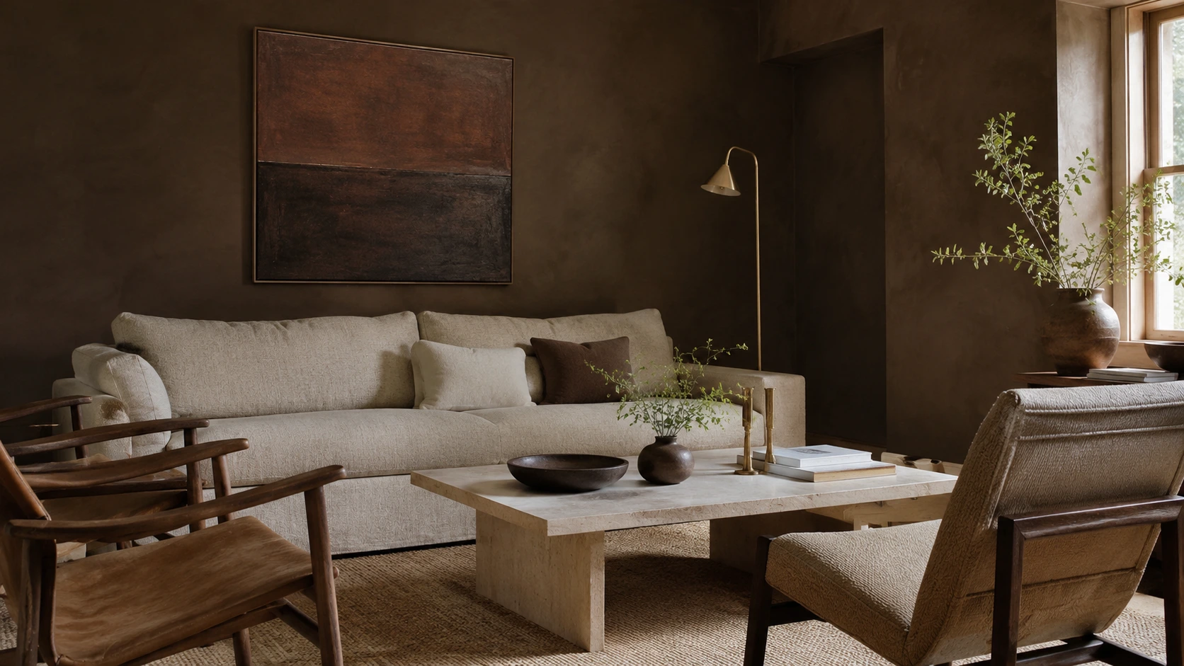
If you compare the best-selling neutral paint colors of 2018 against 2026, the shift in undertone formulation is remarkable:
Homeowners realized that sterile white and cool gray require intense southern sunlight to look welcoming; in northern or overcast light, they appear muddy and cold.
Warm neutrals—such as mushroom, oatmeal, ecru, and aged parchment—maintain their luminosity regardless of window exposure because their warm base pigments gently interact with artificial 2700K ambient lighting.
Design Studio Resource
Test how warm undertones perform under your specific window exposures before buying paint with our interactive Paint LRV & Lighting Predictor.
In the 1stDibs Annual Trends Survey, over 84% of professional interior designers reported incorporating vintage or antique furnishings into every residential project.
This is not nostalgia; it is a structural reaction against the commodification of flat-pack and catalog design. When an entire room is purchased from one store in a single weekend, it lacks emotional patina and temporal depth.
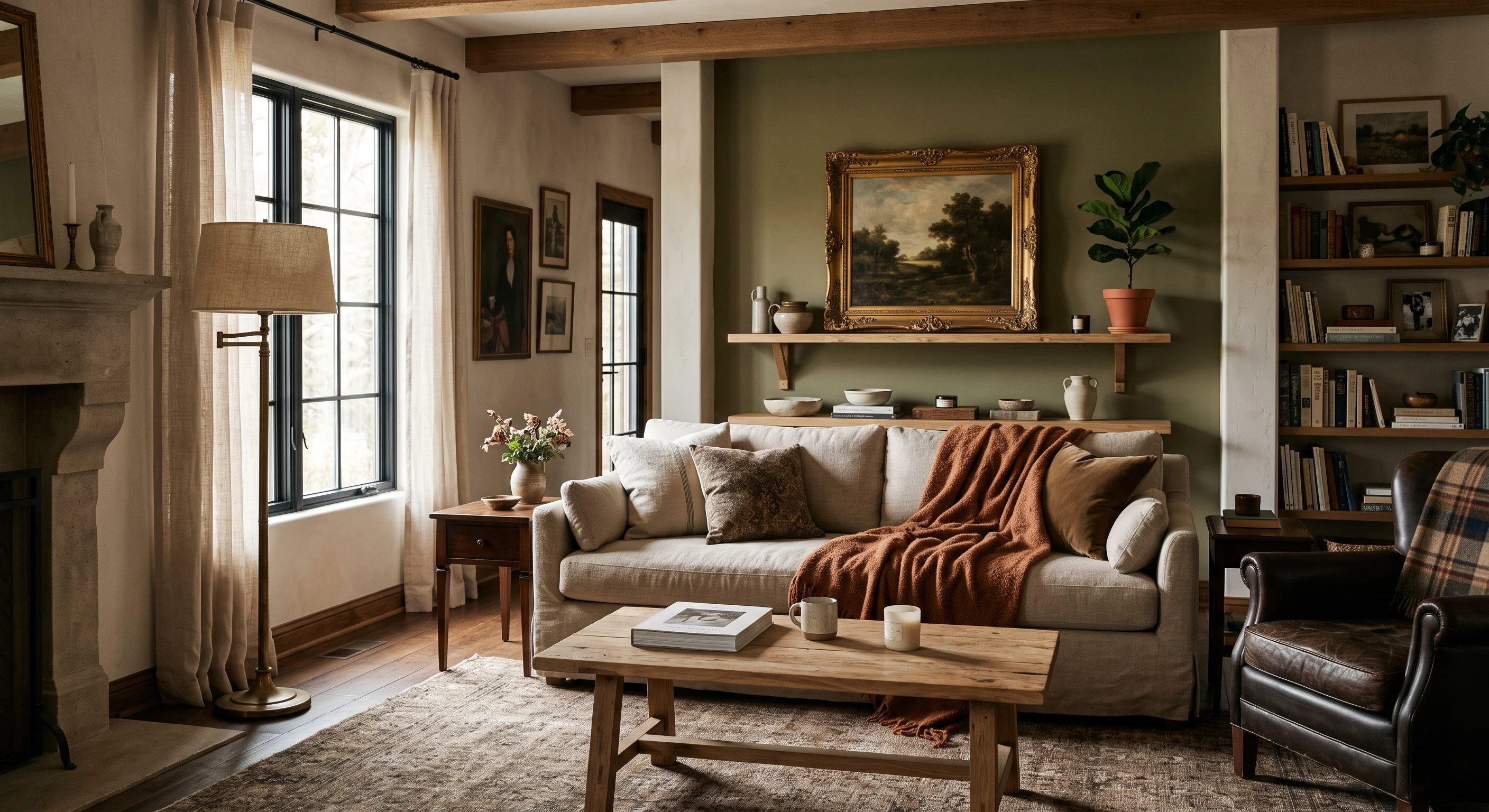
When these two worlds meet, the room feels collected over a lifetime rather than staged for a real estate listing.
To ensure your home investments appreciate in daily joy and design longevity, use this quick checklist:
The design landscape of 2026 rewards authenticity, warmth, and human scale. By anchoring your home in rich chocolate browns, luminous warm neutrals, and timeless vintage materials, you create an environment that feels finished today and remains captivating for years to come.
Written by
Sarah BigelowLead Designer & Founder, Bigelow Designs
Lead Designer & Founder at Bigelow Designs, specializing in considered, evidence-based residential interiors.
Keep reading
Is 2026 the year we finally abandon cold minimalism? Discover which interior trends are actually worth your money and which ones to let pass.
7 min read
The fastest way to make a home look expensive is not buying expensive decor. It is fixing the scale, light, and material mistakes most rooms are built around.
6 min read
The trend cycle wants you to replace your home every year. A veteran designer explains which current ideas have staying power—and which ones will look tired fast.
6 min read
The Insider Circle
Craving more interior inspiration? Watch our exclusive behind-the-scenes room tours on TikTok and join our Facebook community for daily design secrets.
Join the conversation
Thoughts, questions, or your own experience with this piece? Sign in with your Facebook profile to reply.

